︎︎︎︎︎︎︎︎︎ BACK
Brand ID — 2019
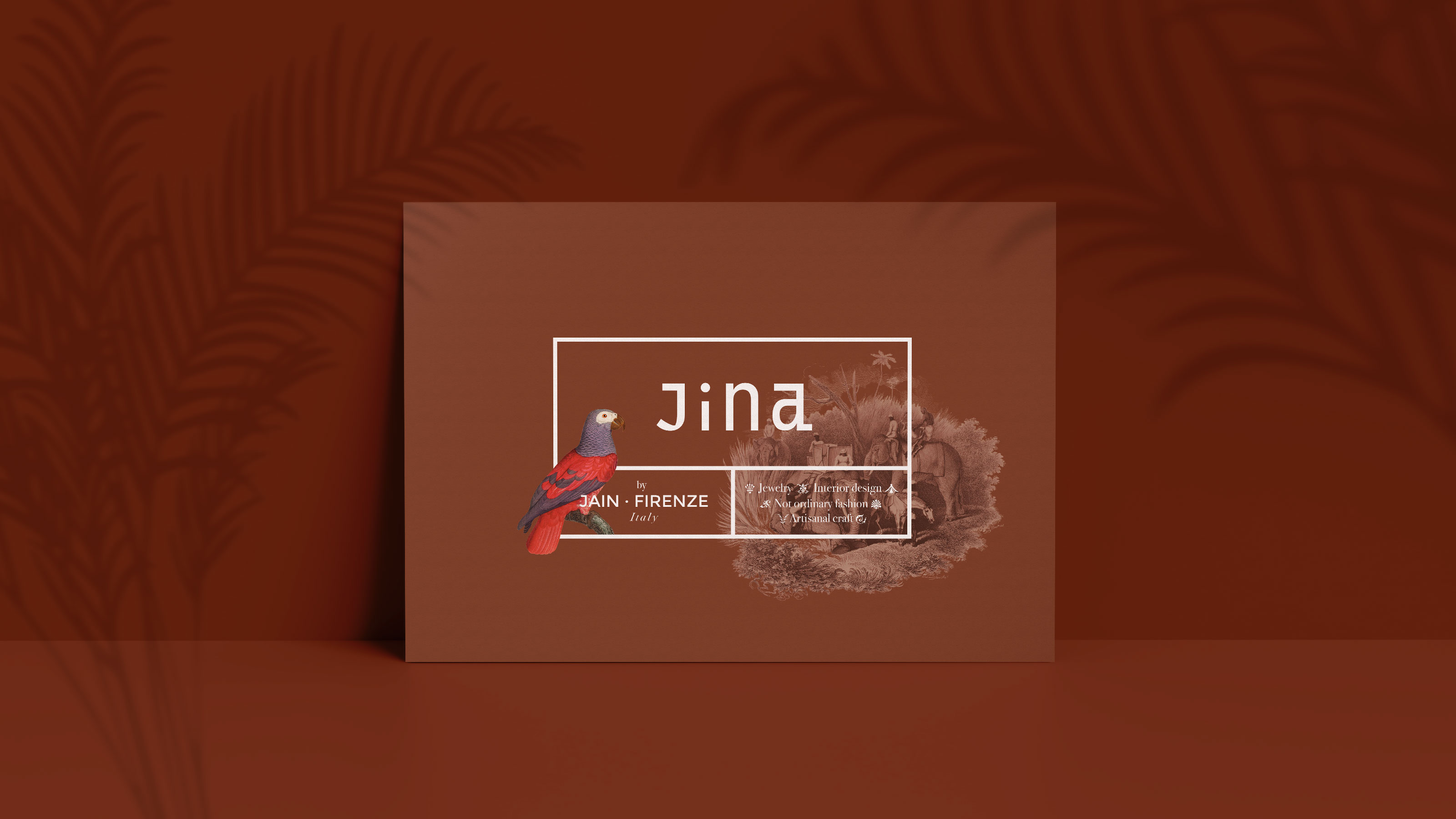
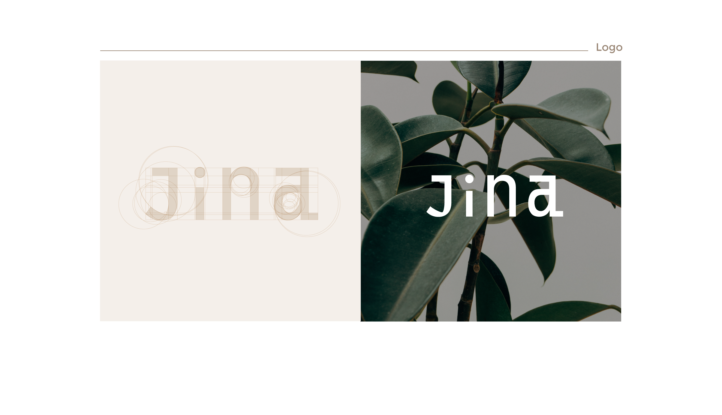
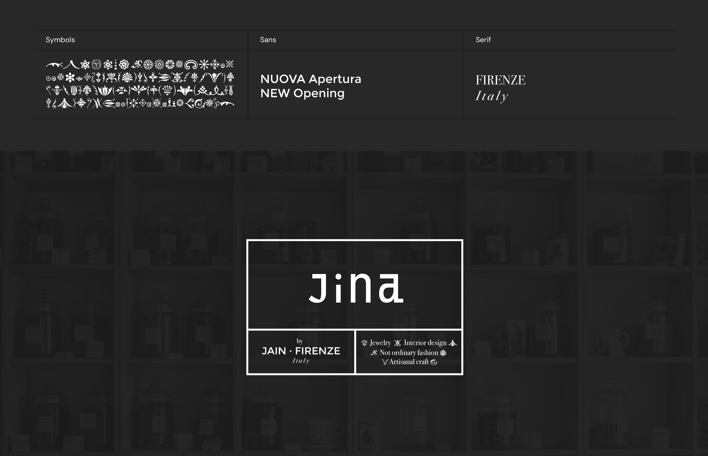
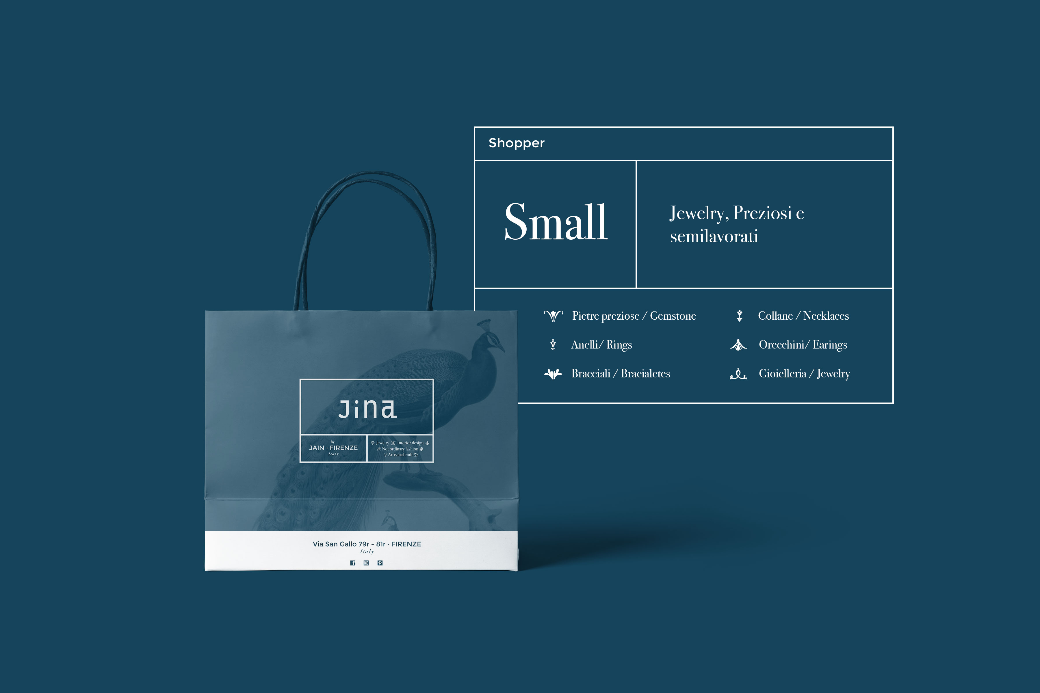
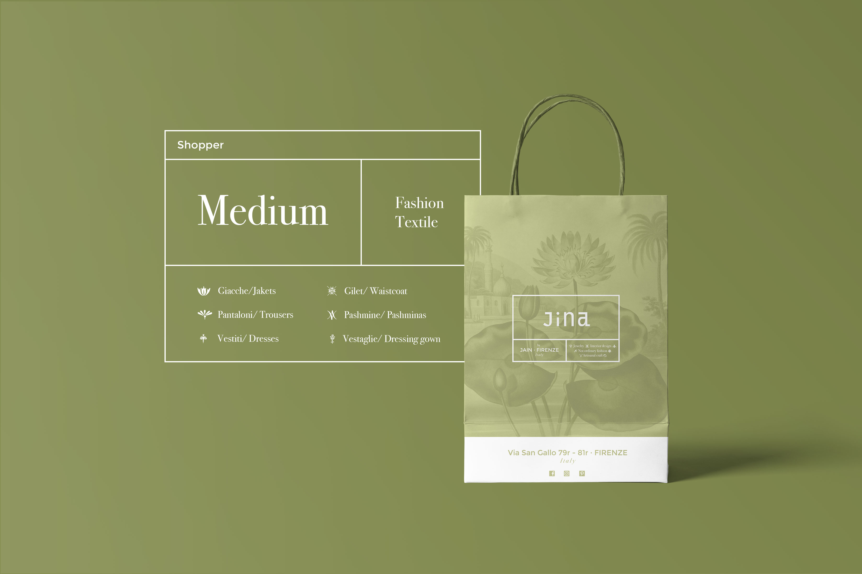
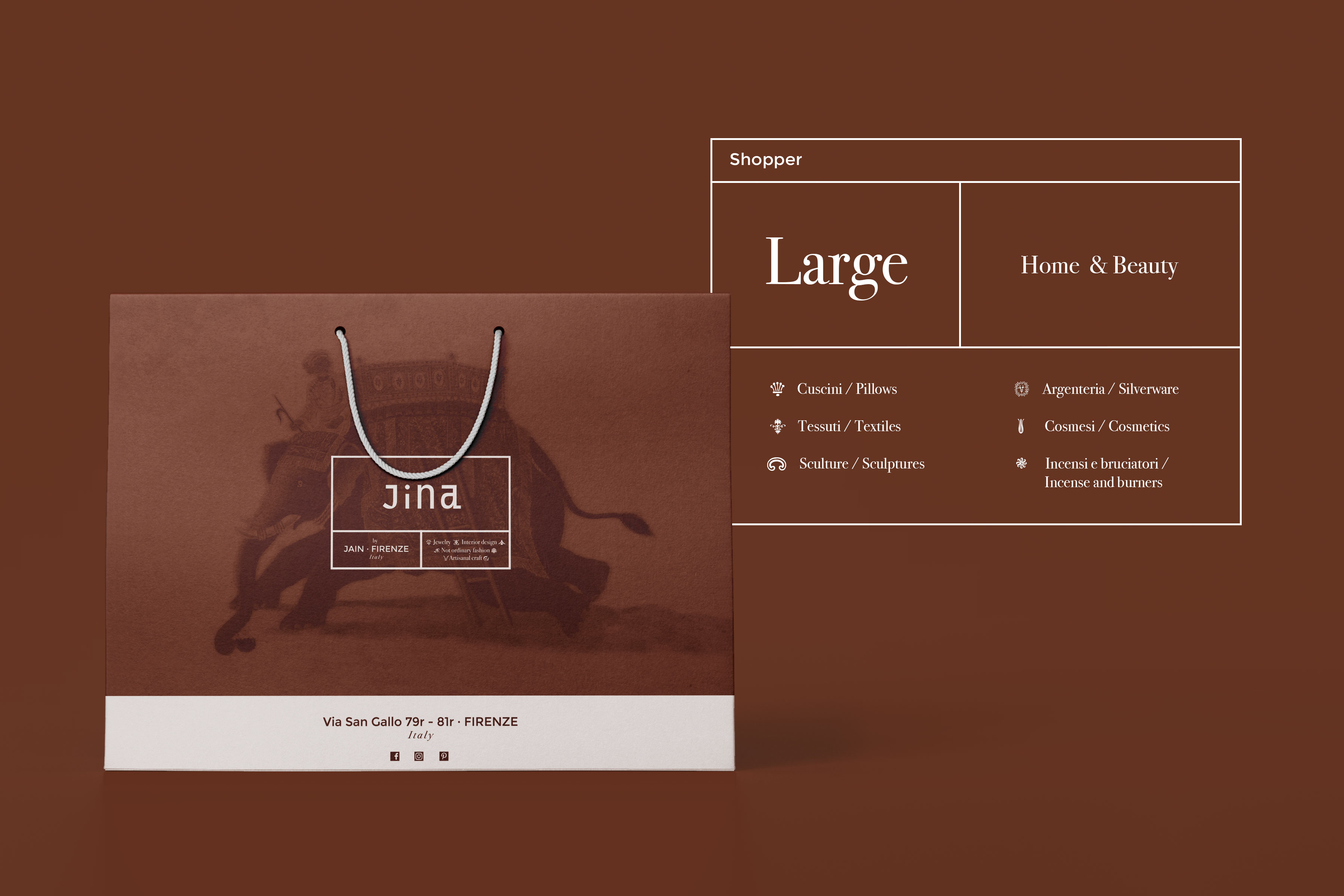
JINA
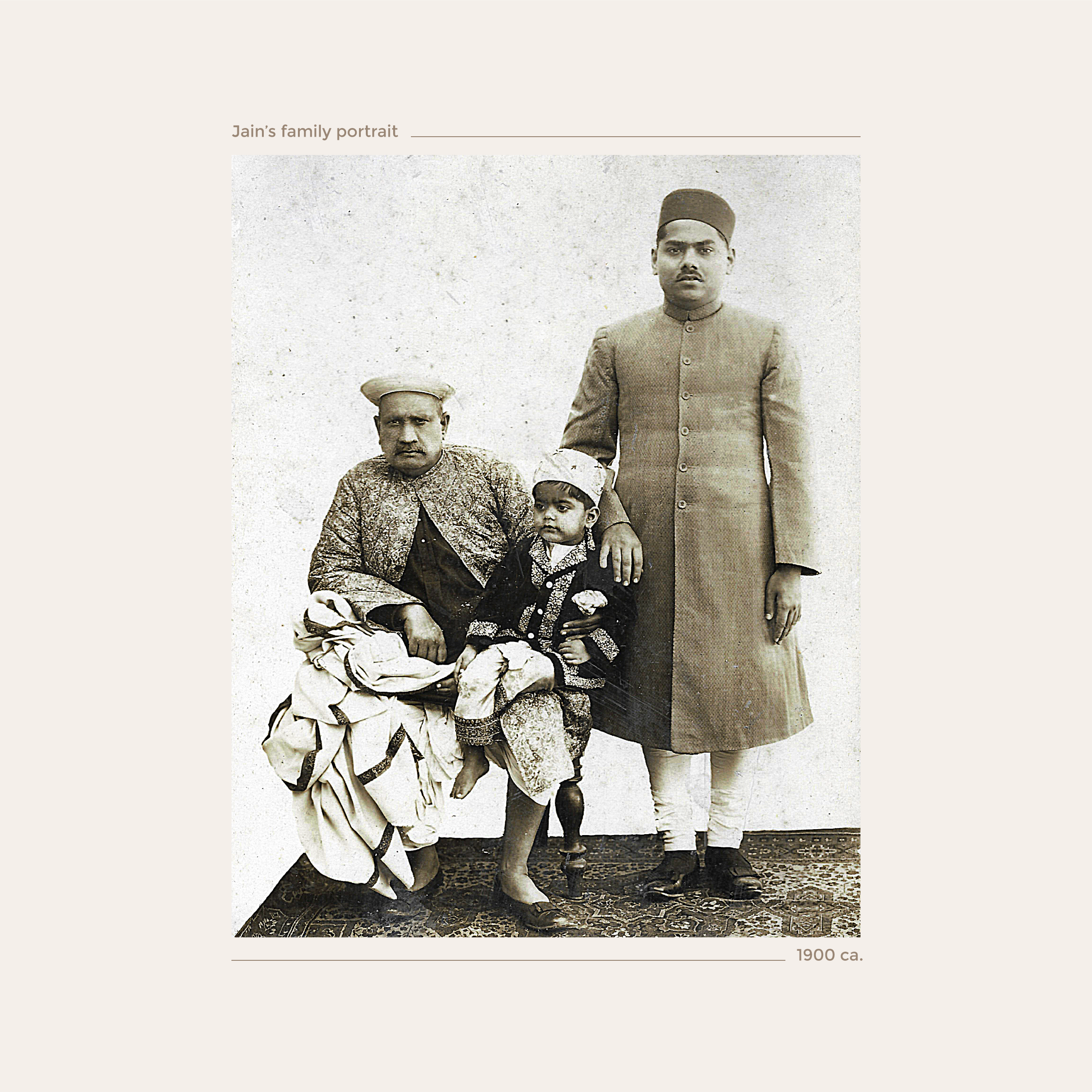
The Jain Firenze is a business established 20 years ago in Florence, Italy, by Mr. Pankaj Jain, whose family has been working with precious stones and jewelry for generations. It is common for many Jainists, like them, to excel in this field, as they belong to a non-violent community in India, historically known as the world's first vegetarians and highly respected in society. To celebrate the opening of their new boutique on Via San Gallo in Florence, and to honor the blend of Florentine and Indian cultures, Mr. Jain decided to undertake a complete rebranding.
Concept
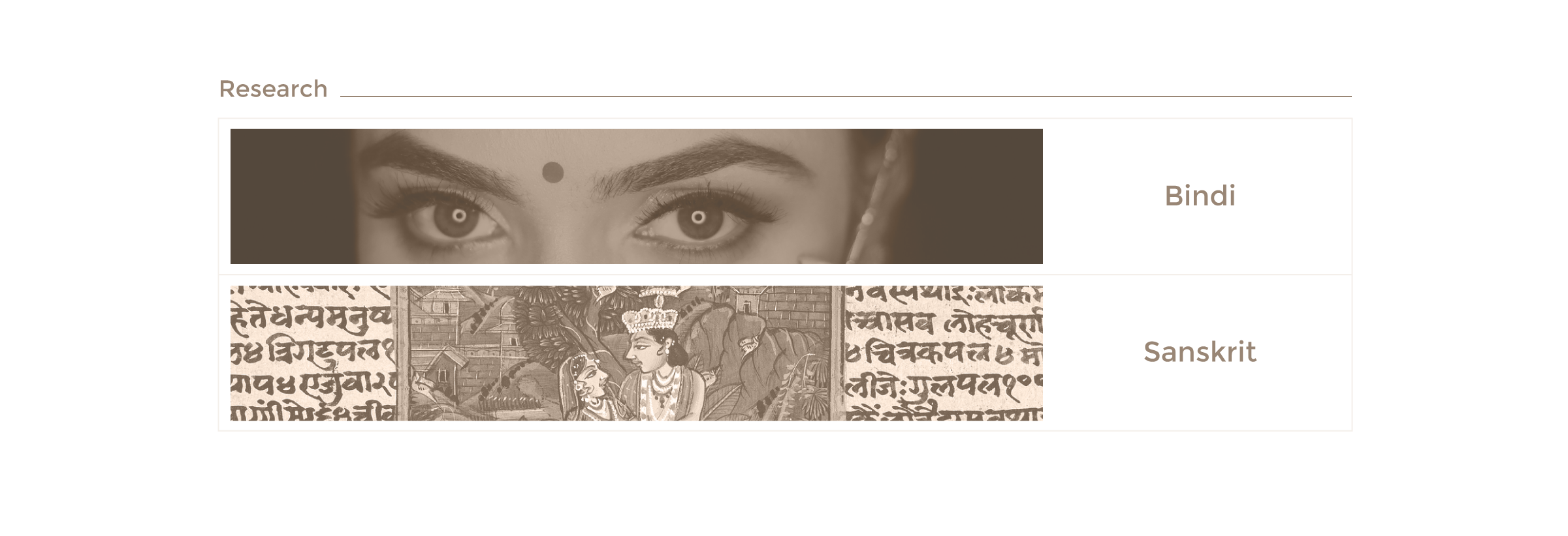
The Jainist faith revolves around the myth of the "Jina," their prophet, whose name means "the conqueror" or "the winner." Interestingly, "Gina" (or "Gino" for males) is a common name in Italy, especially in Florence, and its pronunciation closely matches "Jina."
This short and memorable name makes it easy for people to recognize and associate with something positive and approachable, while also hinting at an exotic and unique identity.
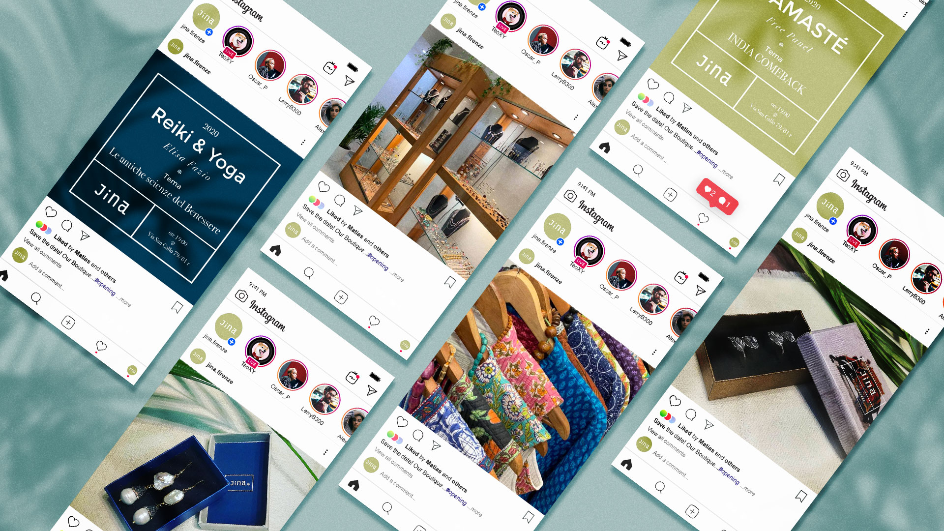
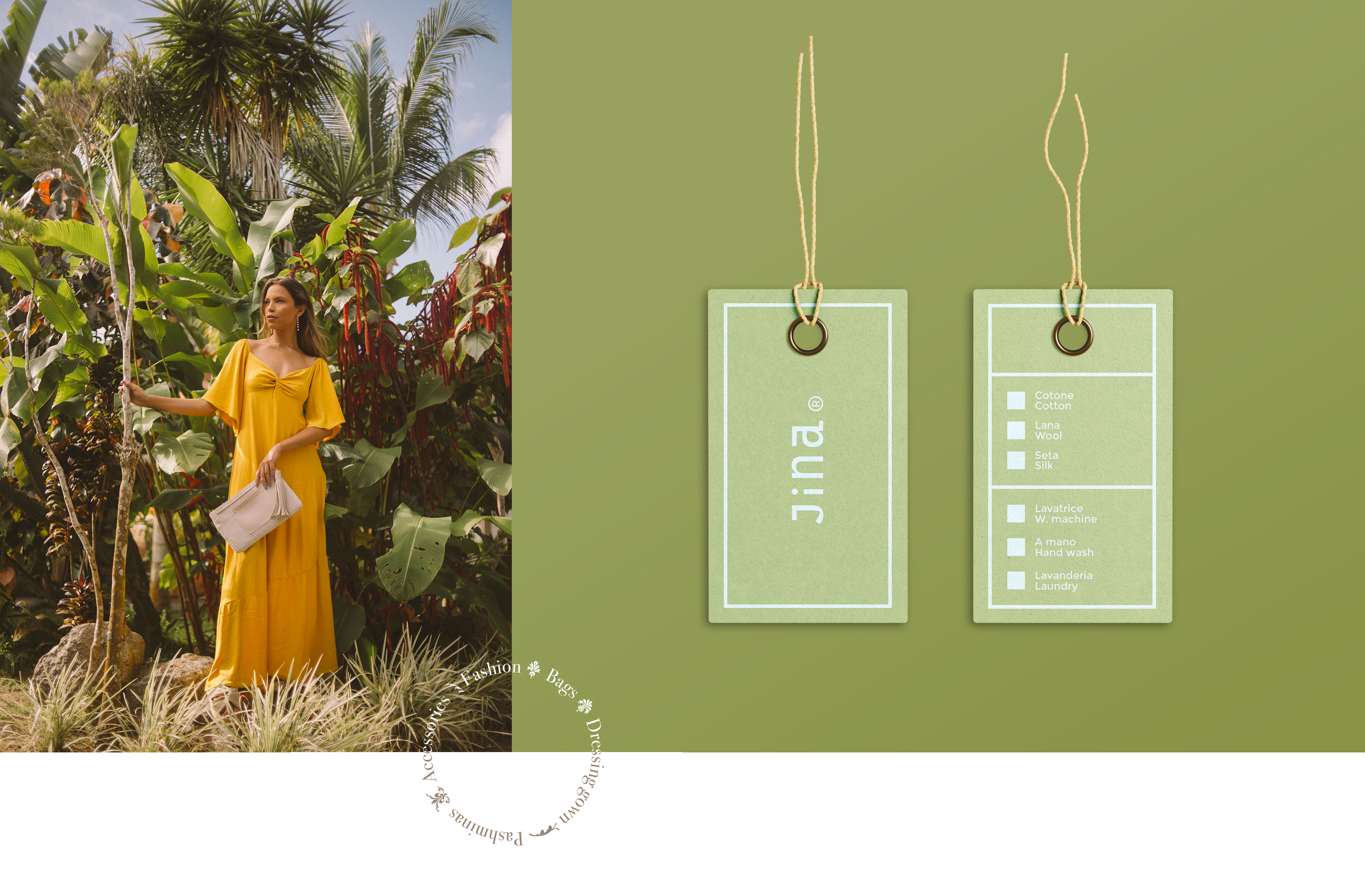
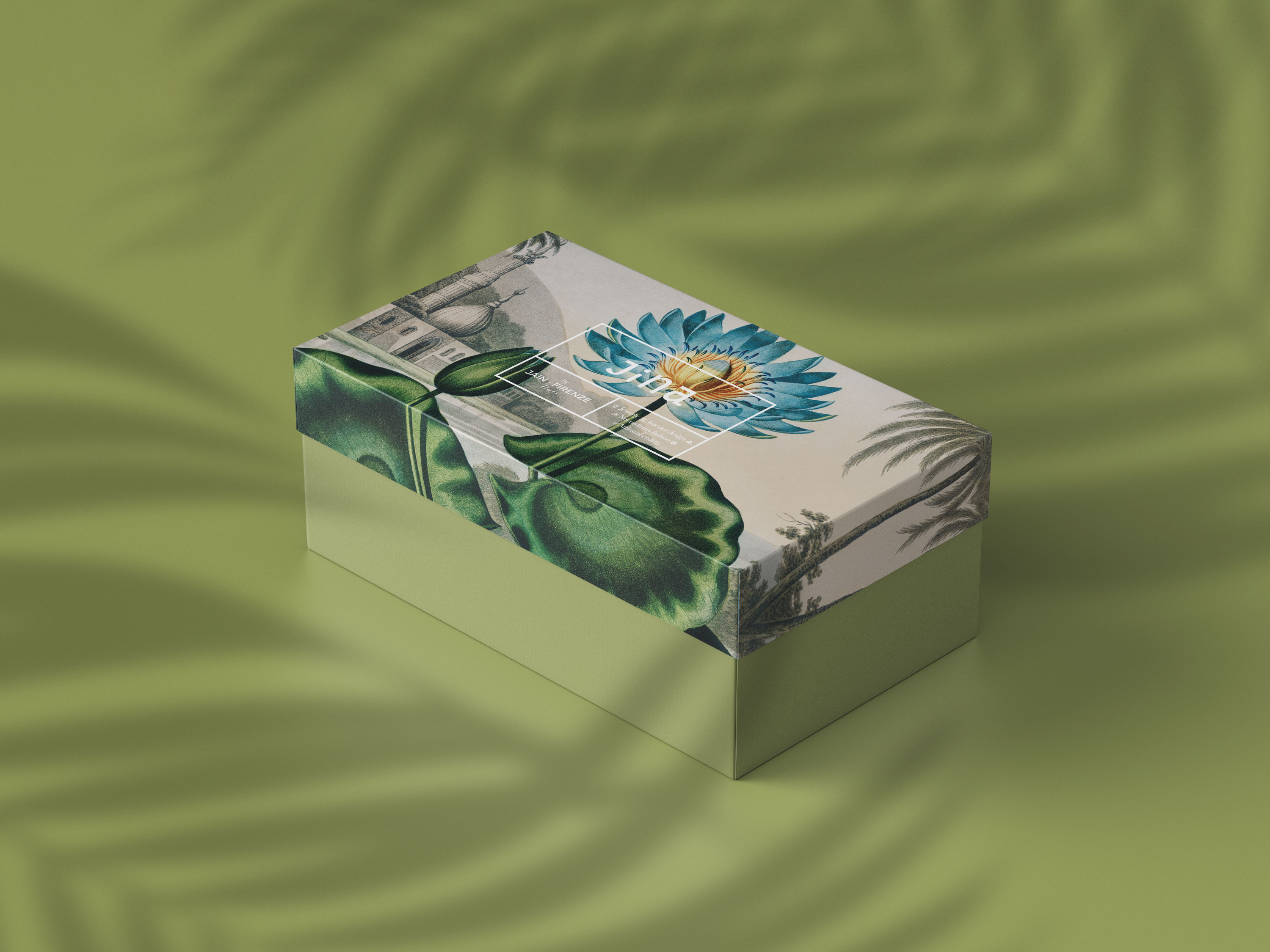
The shop offers a wide range of products. To help guide customers through this sort of "wunderkammer" (cabinet of curiosities), the name has also been turned into an acronym, serving as the store's tagline: Jewelry, Interior Design, Not-Ordinary Fashion, Artisanal Craft. This approach extends to the store's color palette, which helps categorize and suggest the type of each product.
The wunderkammer theme, as a non-linear but curated collection, inspired the design evolution. It incorporates a grid that contains the logo and other information, providing numerous opportunities to experiment with layouts and inspire imagination. This approach enhances the business's core allure, blending extravagant inspirations to celebrate its fascinating essence.
JINA
The Jain Firenze is a business established 20 years ago in Florence, Italy, by Mr. Pankaj Jain, whose family has been working with precious stones and jewelry for generations. It is common for many Jainists, like them, to excel in this field, as they belong to a non-violent community in India, historically known as the world's first vegetarians and highly respected in society. To celebrate the opening of their new boutique on Via San Gallo in Florence, and to honor the blend of Florentine and Indian cultures, Mr. Jain decided to undertake a complete rebranding.
Concept
The Jainist faith revolves around the myth of the "Jina," their prophet, whose name means "the conqueror" or "the winner." Interestingly, "Gina" (or "Gino" for males) is a common name in Italy, especially in Florence, and its pronunciation closely matches "Jina."
This short and memorable name makes it easy for people to recognize and associate with something positive and approachable, while also hinting at an exotic and unique identity.
The shop offers a wide range of products. To help guide customers through this sort of "wunderkammer" (cabinet of curiosities), the name has also been turned into an acronym, serving as the store's tagline: Jewelry, Interior Design, Not-Ordinary Fashion, Artisanal Craft. This approach extends to the store's color palette, which helps categorize and suggest the type of each product.
The wunderkammer theme, as a non-linear but curated collection, inspired the design evolution. It incorporates a grid that contains the logo and other information, providing numerous opportunities to experiment with layouts and inspire imagination. This approach enhances the business's core allure, blending extravagant inspirations to celebrate its fascinating essence.


︎︎︎︎︎︎︎︎︎ BACK
Brand ID — 2018
Affetti Da
This project received a “Finalist Mention” in the “Logo Against Alzheimer’s” contest for Affetti Da, an Italian association that provides assistance to the families of Alzheimer’s patients.
The jury that selected my work included prominent figures such as:
Milo Manara, Milton Glaser, Federico Babina, Margherita Urbani, Pietro Corraini, Mario Trimarchi (AIAP), and Roberta Pantieri (Affetti Da).
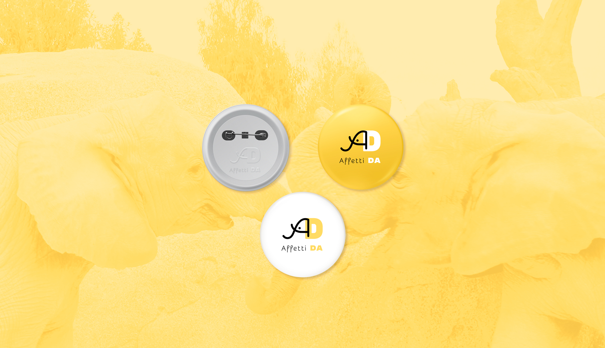
Elephants are widely known for having one of the strongest memories in nature. This idea highlights how human collective memory is not merely the sum of individual memories but also a shared system that defines us and enables interaction.
This is the concept behind the logo, designed using the letters “A” and “D” from Affetti Da. These two letters are crafted with two contrasting fonts: one bold, structured, and solid—symbolizing the weight and seriousness of the “Da” part of the name—and the other soft, imaginative, and dynamic—representing the care inherent in the word affetti. Together, these letters form the face and ear of an elephant, rendered in yellow and black to symbolize light and shadow.
Alzheimer’s creates gaps in memory that we must strive to fill—with research, patience, and creativity, sometimes inventing new ways to approach everything as if seeing it for the first time.
The logo design opens up opportunities for creative applications, combining letters and icons to represent life’s elements while restoring meaning and values in the fight against Alzheimer’s. For example, it can be used on a mug with thermochromic ink, in advertisements, or in the association’s infographics—helping to connect and evoke even more memories.
Affetti Da
This project received a “Finalist Mention” in the “Logo Against Alzheimer’s” contest for Affetti Da, an Italian association that provides assistance to the families of Alzheimer’s patients.
The jury that selected my work included prominent figures such as:
Milo Manara, Milton Glaser, Federico Babina, Margherita Urbani, Pietro Corraini, Mario Trimarchi (AIAP), and Roberta Pantieri (Affetti Da).
Brief
Elephants are widely known for having one of the strongest memories in nature. This idea highlights how human collective memory is not merely the sum of individual memories but also a shared system that defines us and enables interaction.
This is the concept behind the logo, designed using the letters “A” and “D” from Affetti Da. These two letters are crafted with two contrasting fonts: one bold, structured, and solid—symbolizing the weight and seriousness of the “Da” part of the name—and the other soft, imaginative, and dynamic—representing the care inherent in the word affetti. Together, these letters form the face and ear of an elephant, rendered in yellow and black to symbolize light and shadow.
Alzheimer’s creates gaps in memory that we must strive to fill—with research, patience, and creativity, sometimes inventing new ways to approach everything as if seeing it for the first time.
The logo design opens up opportunities for creative applications, combining letters and icons to represent life’s elements while restoring meaning and values in the fight against Alzheimer’s. For example, it can be used on a mug with thermochromic ink, in advertisements, or in the association’s infographics—helping to connect and evoke even more memories.


︎︎︎︎︎︎︎︎︎ BACK
Corporate — 2017
OVIDIO TECH
Ovidio Tech is a holding and venture company operating primarily in the tech sector, though not exclusively. The client’s request was to convey change as an essential state for growth and transformation—of ideas, life, and business.
The name Ovidio draws inspiration from the ancient Roman writer, renowned as a key reference for Roman mythology. One of Ovidio’s most celebrated works is Metamorphoses, a collection of myths that explore metaphorical and literal transformations of individuals into animals, plants, and objects.
Building on this concept, the logo design incorporates the geometric arrangement of letters to symbolize the lunar phases—an ultimate metaphor for the process of continuous growth and transformation.
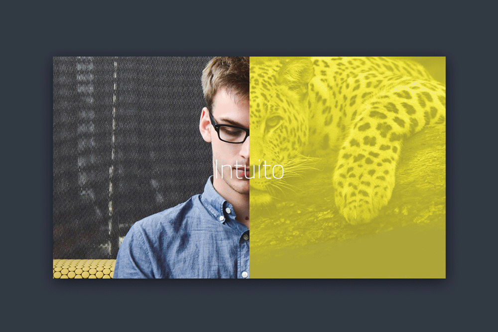
In the accompanying visual campaign, the theme of metamorphosis is reinterpreted through striking “half-and-half” images. These depict individuals animated by inner traits symbolized by an animal and a corresponding color, evoking a powerful call to action: embrace change.
OVIDIO TECH
Ovidio Tech is a holding and venture company operating primarily in the tech sector, though not exclusively. The client’s request was to convey change as an essential state for growth and transformation—of ideas, life, and business.
The name Ovidio draws inspiration from the ancient Roman writer, renowned as a key reference for Roman mythology. One of Ovidio’s most celebrated works is Metamorphoses, a collection of myths that explore metaphorical and literal transformations of individuals into animals, plants, and objects.
Building on this concept, the logo design incorporates the geometric arrangement of letters to symbolize the lunar phases—an ultimate metaphor for the process of continuous growth and transformation.
In the accompanying visual campaign, the theme of metamorphosis is reinterpreted through striking “half-and-half” images. These depict individuals animated by inner traits symbolized by an animal and a corresponding color, evoking a powerful call to action: embrace change.


︎︎︎︎︎︎︎︎︎ BACK
Corporate — 2016
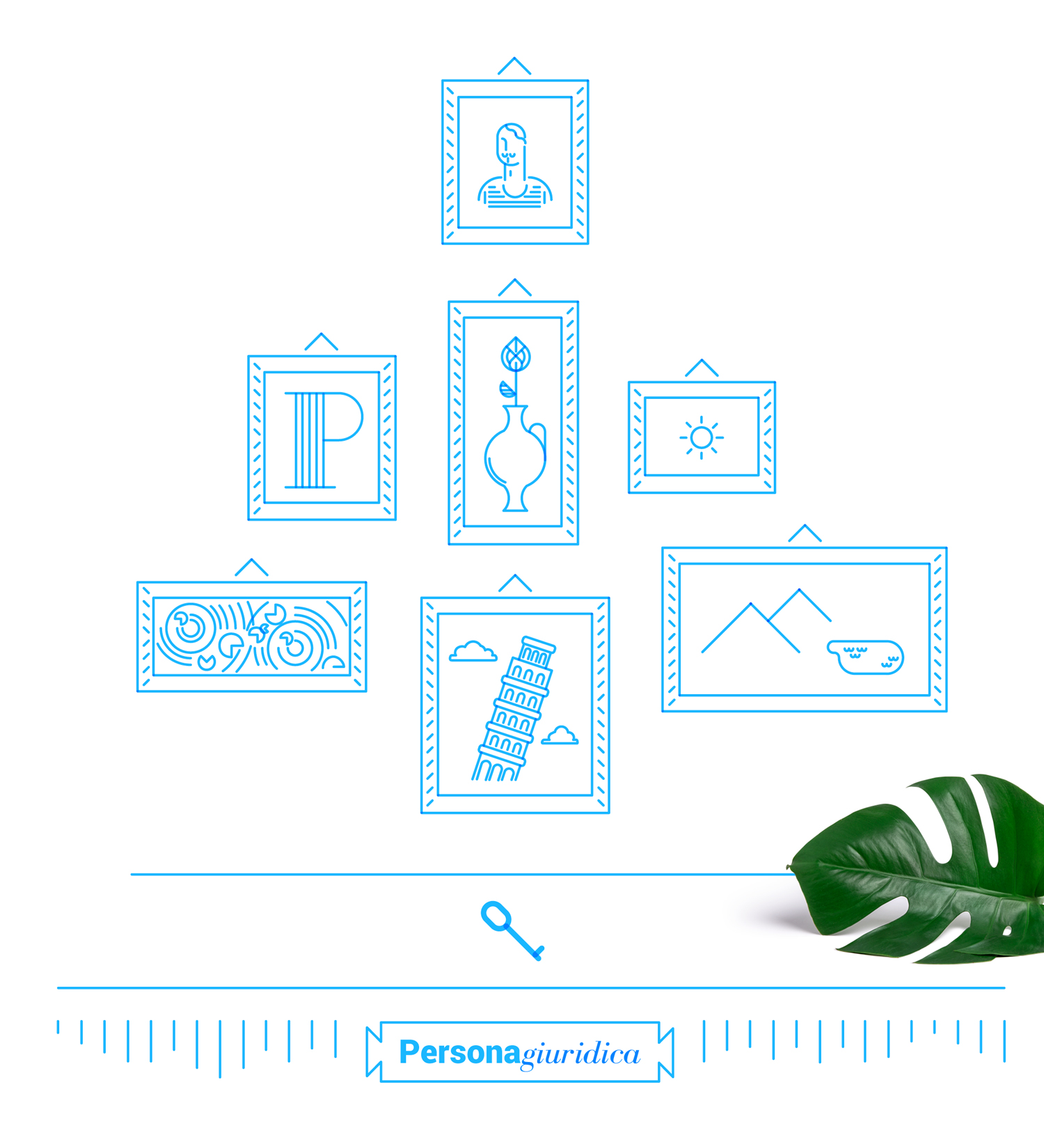
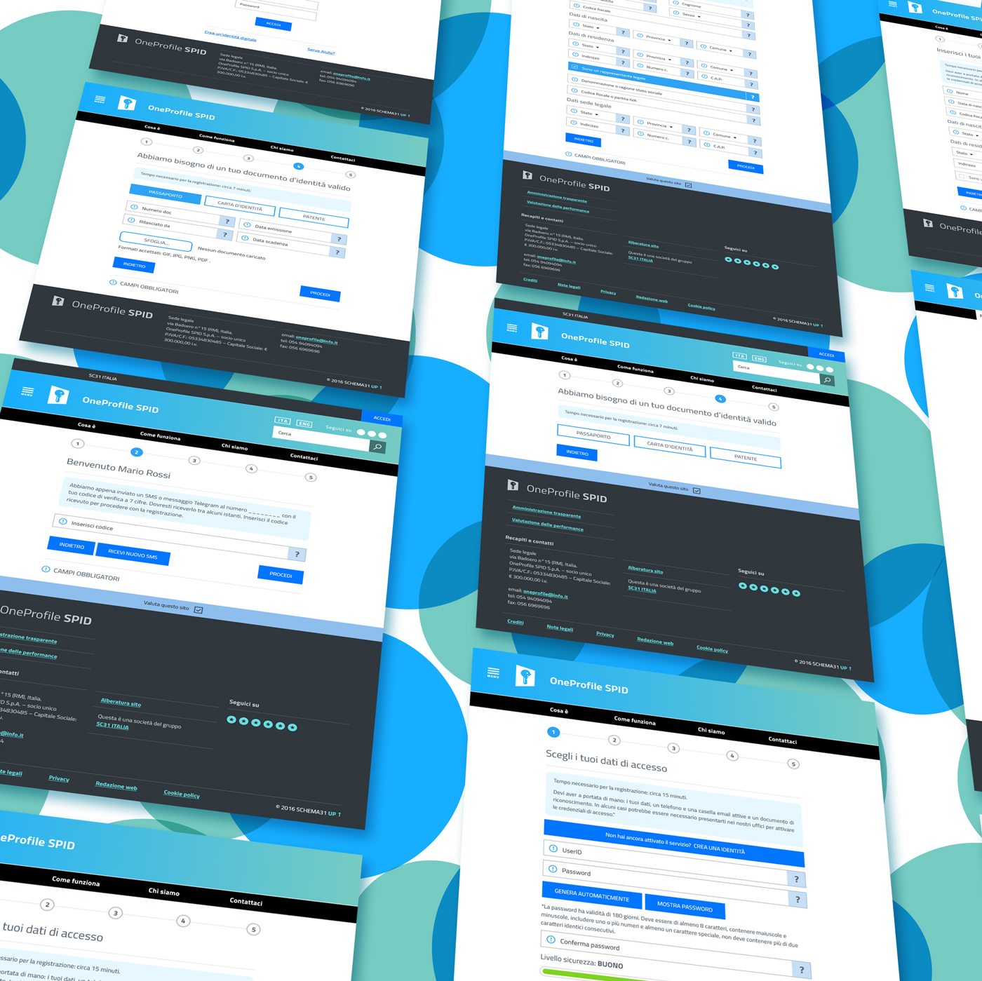
OneProfile
OneProfile is an ID provider designed to simplify the overwhelming proliferation of identity credentials, such as passwords and security steps. It consolidates all your credentials into a single solution—one key for multiple accesses.
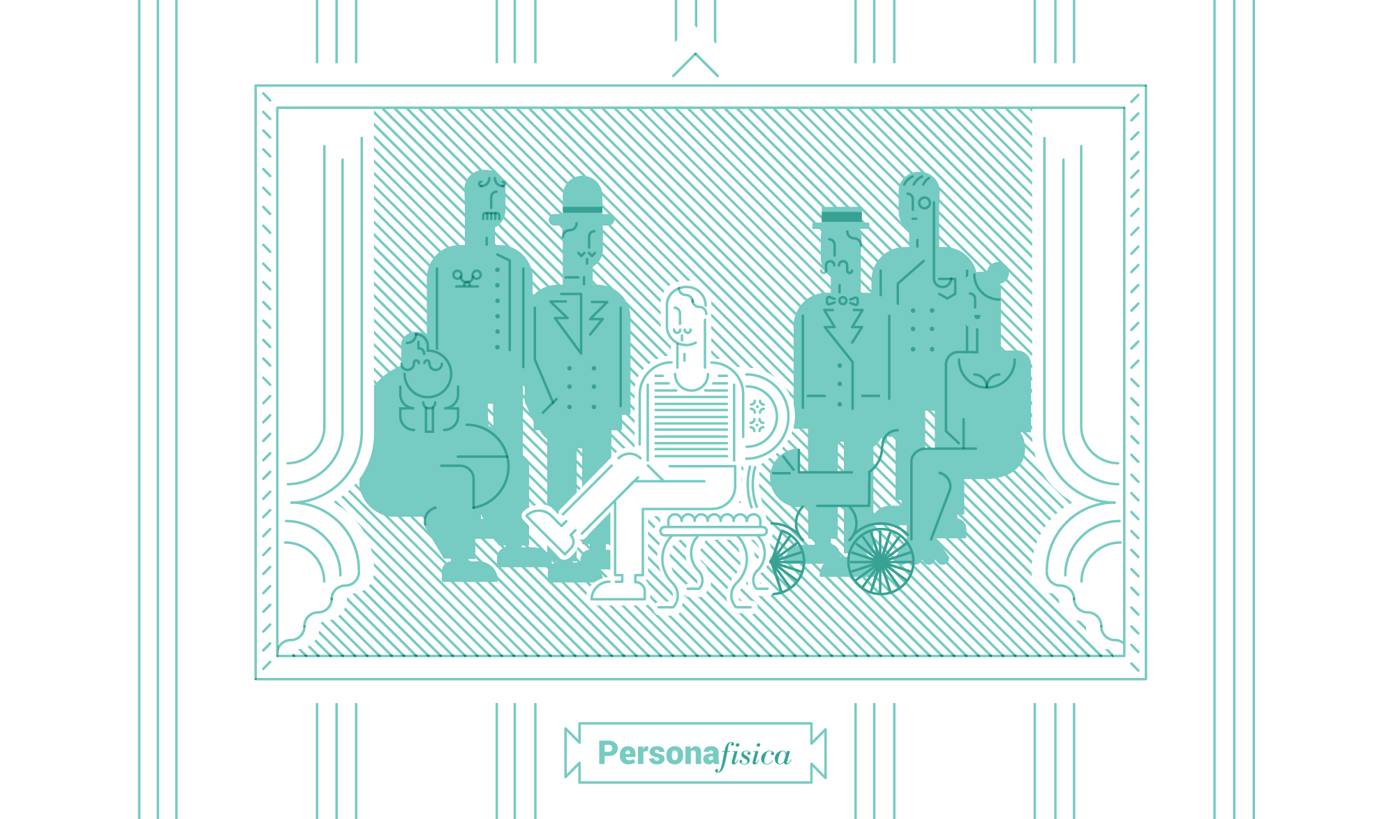
The brand redesign takes inspiration from the concept of a profile, as seen in portrait paintings or photography, and integrates it with the theme of keys. The project adopts a retro-modern aesthetic as a visual reference, using it to explain interactions and legal definitions of identity, such as:
This approach bridges the artistic and functional aspects of identity, making the concept both visually engaging and easy to understand.
OneProfile
OneProfile is an ID provider designed to simplify the overwhelming proliferation of identity credentials, such as passwords and security steps. It consolidates all your credentials into a single solution—one key for multiple accesses.
The brand redesign takes inspiration from the concept of a profile, as seen in portrait paintings or photography, and integrates it with the theme of keys. The project adopts a retro-modern aesthetic as a visual reference, using it to explain interactions and legal definitions of identity, such as:
- “Persona fisica” (physical person): who we are as individual, physical entities.
- “Persona giuridica” (legal person): who we are and what we represent in society through our activities, work, and roles.
This approach bridges the artistic and functional aspects of identity, making the concept both visually engaging and easy to understand.


︎︎︎︎︎︎︎︎︎ BACK
Access management system's design — 2017
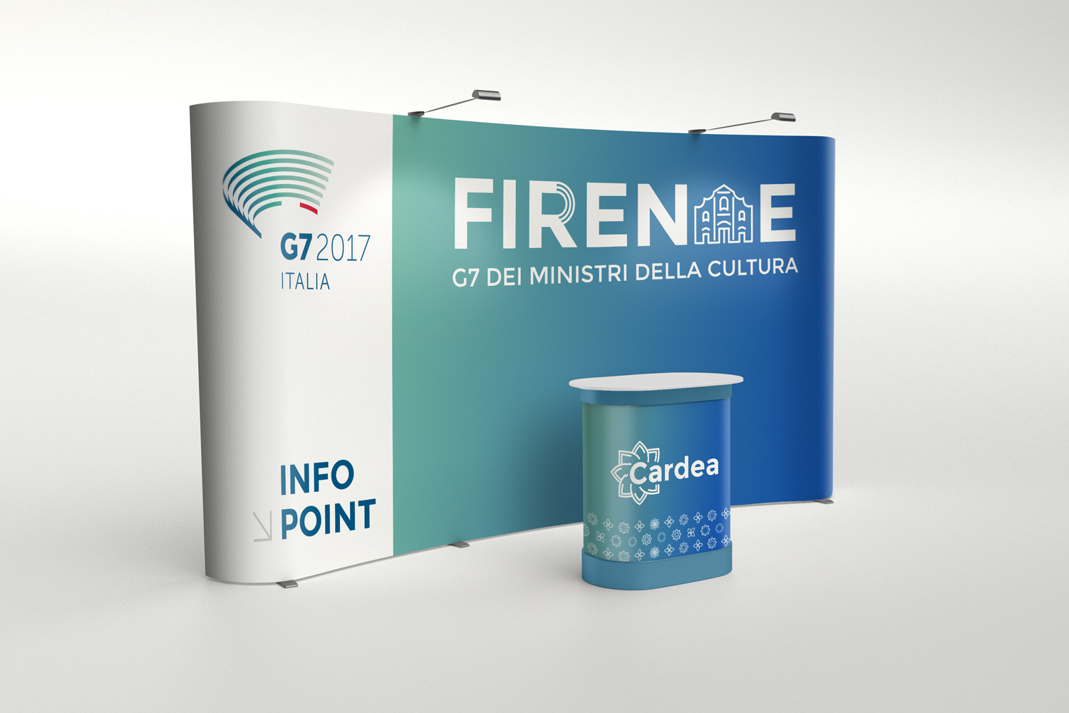
G7 Italia
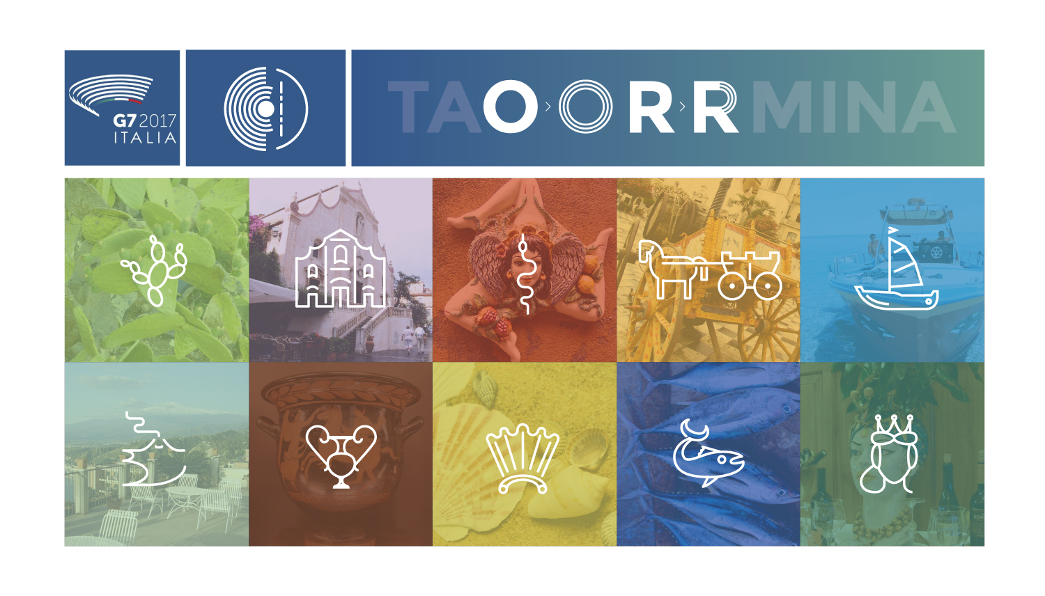
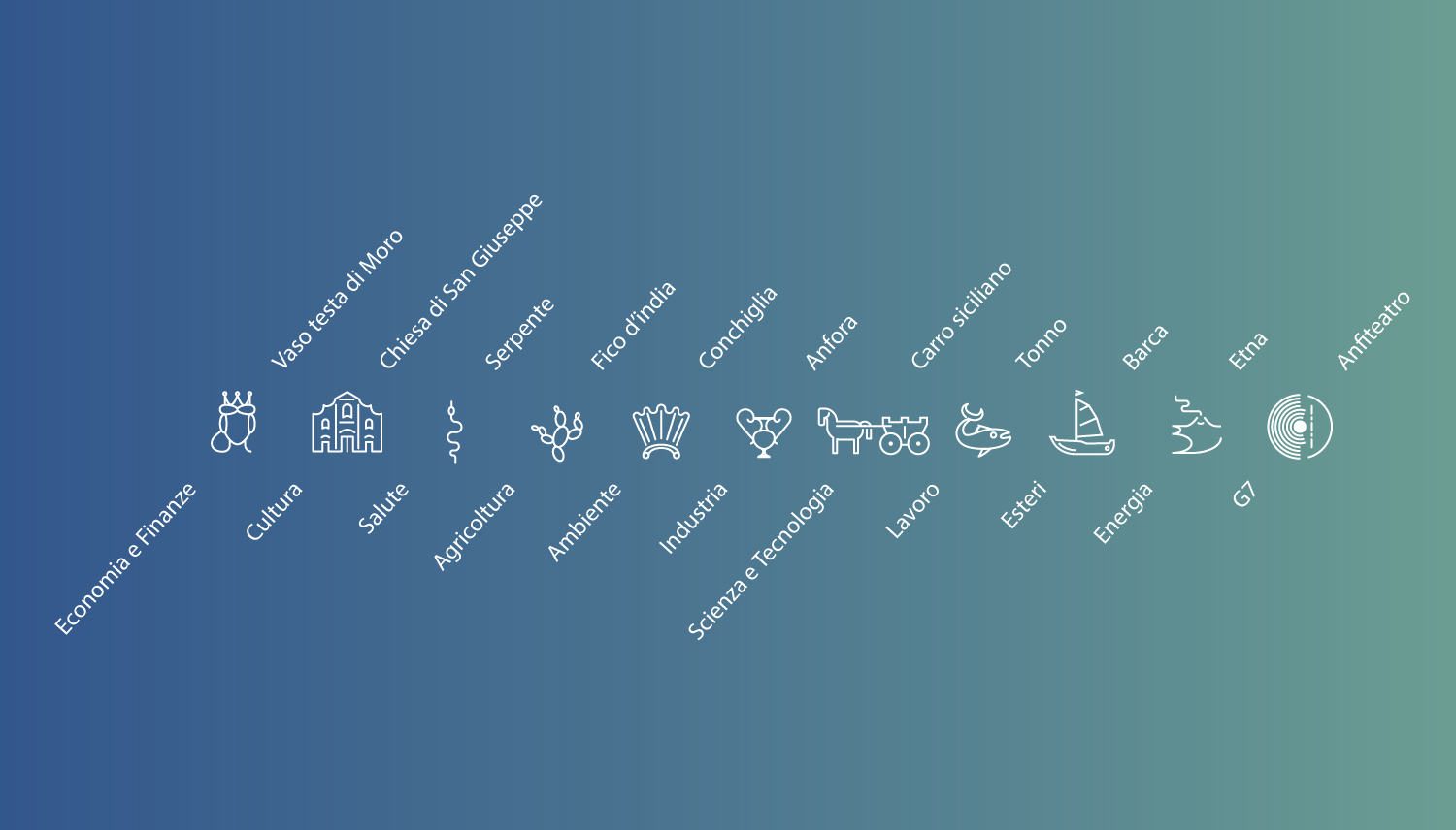
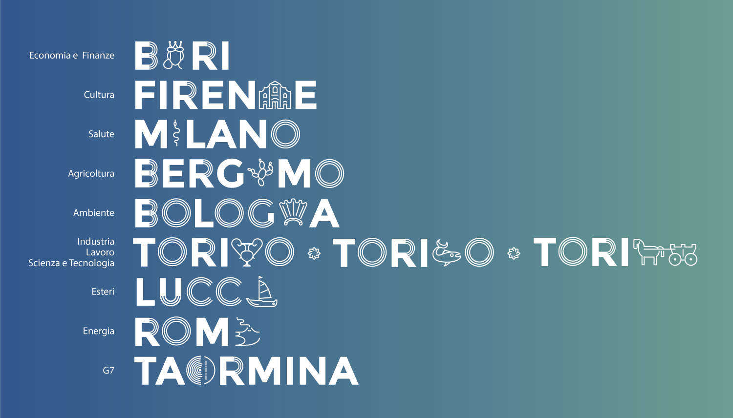
Cardea is a company specializing in access accreditation systems. In 2017, Cardea tasked me with designing the access management system for G7 Italia 2017, the international political forum attended by the world’s leading industrialized democracies.
That year, Italy held the presidency of the G7, and the event was named after the Sicilian city of Taormina, where it first took place. Following the initial summit in Taormina, the G7 was distributed across various forums in multiple Italian cities, each addressing a specific theme.
Using the event's pre-established logo and color palette (not created by me), I designed and developed a cohesive corporate identity system. My goal was to integrate Taormina’s unique characteristics with the visual elements of the logo, creating a unifying visual language that connected all the forums while maintaining their individual identities.
G7 Italia
Cardea is a company specializing in access accreditation systems. In 2017, Cardea tasked me with designing the access management system for G7 Italia 2017, the international political forum attended by the world’s leading industrialized democracies.
That year, Italy held the presidency of the G7, and the event was named after the Sicilian city of Taormina, where it first took place. Following the initial summit in Taormina, the G7 was distributed across various forums in multiple Italian cities, each addressing a specific theme.
Using the event's pre-established logo and color palette (not created by me), I designed and developed a cohesive corporate identity system. My goal was to integrate Taormina’s unique characteristics with the visual elements of the logo, creating a unifying visual language that connected all the forums while maintaining their individual identities.